The Evolution and History of the Apple Logo
![]() Apple Inc.
Apple Inc.
Apple Inc. is an American multinational corporation headquartered in Cupertino, California, that designs, develops, and sells consumer electronics, computer software, online services, and personal computers. Its best-known hardware products are the Mac line of computers, the iPod media player, the iPhone smartphone, the iPad tablet computer, and the Apple Watch smartwatch. Its online services include iCloud, the iTunes Store, and the App Store. Apple's consumer software includes the OS X and iOS operating systems, the iTunes media browser, the Safari web browser, and the iLife and iWork creativity and productivity suites.
Apple was founded by Steve Jobs, Steve Wozniak, and Ronald Wayne on April 1, 1976, to develop and sell personal computers. It was incorporated as Apple Computer, Inc. on January 3, 1977, and was renamed as Apple Inc. on January 9, 2007, to reflect its shifted focus towards consumer electronics. Apple (NASDAQ:APPL) joined the Dow Jones Industrial Average on March 19, 2015.
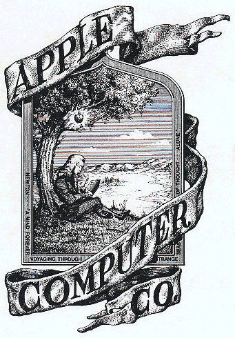
The Newton Crest: 1976-1976
The first Apple logo was designed in 1976 by Ronald Wayne, sometimes referred to as the third co-founder of Apple. The logo depicts Isaac Newton sitting under a tree, an apple dangling precipitously above his head. The phrase on the outside border reads, “Newton… A Mind Forever Voyaging Through Strange Seas of Thought … Alone.”

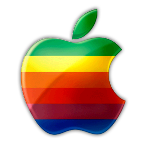
The Rainbow Logo: 1976-1998
Not surprisingly, the above logo only lasted a year before Steve Jobs commissioned graphic designer Rob Janoff to come up with something, oh I don’t know, a little bit more modern. Janoff’s eventual design would go on to become one of the most iconic and recognizable corporate logos in history.
According to Janoff, the “bite” in the Apple logo was originally implemented so that people would know that it represented an apple, and not a tomato. It also lent itself to a nerdy play on words (bite/byte), a fitting reference for a tech company. Quick sidenote: Corporate design sure was a lot simpler in the 70′s. Nowadays, companies like Pepsi spend millions of dollars on logo re-designs that are based on complete BS and new age mumbo jumbo.

As for the rainbow stripes of the logo, Steve Jobs is rumored to have insisted on using a colorful logo as a means to “humanize” the company. Janoff has said that there was no rhyme or reason behind the placement of the colors themselves, noting that he wanted to have green at the top “because that’s where the leaf was.”
The relatively simple origins of the rainbow colored Apple logo hasn’t stopped some from reading a bit too much into what it represents. Jean-Louis Gassée, former Apple executive and founder of BeOS, quipped about the logo:
The passion of the French knows no bounds!
The multi-colored Apple logo was in use for 22 years before it was axed by Steve Jobs less than a year after his return to Apple in 1997. In its place was a new logo that did away with the colorful stripes and replaced it with a more modern monochromatic look that has taken on a variety of sizes and colors over the past few years. The overall shape of the logo, however, remains unchanged from its original inception 33 years ago.
The Monochrome Logo: 1998 – Present
TInkering with one of the most recognizable logos in the world wasn’t done simply because Steve Jobs is always looking to change things up. When Jobs returned to Apple in 1997, the company was bleeding money, and Jobs and Co. realized that the Apple logo could be leveraged to their advantage. That meant experimenting with larger logos to make it more prominent. If the shape of the Apple logo was universally recognizable, why not not put it where people could see it?
That being the case, placing a large rainbow Apple logo on top of the original Bondi Blue iMac, for example, would have looked silly, childish, and out of place. Not exactly the direction Jobs wanted to lead Apple in. So instead of placing a somewhat minuscule rainbow colored Apple logo on its products, Apple began placing sizeable and Monochrome styled logos on its products in all sorts of places: on top of the original iMac, on the side of the Powermac G3 Tower, and in an assortment of colors on the good ole iBooks. This trend, which began in 1998, continues to this day.
The rainbow colored logo might always be a source of nostalgia for Mac enthusiasts, but the monochrome logo allows Apple greater flexibility when it comes to branding its products. Also, Steve Jobs isn’t exactly the type to get wrapped up in warm fuzzy feelings of nostalgia. When Jobs returned to Apple, he needed to transform Apple’s image from that of a failing company into one capable of churning out sleek and cutting edge products, and he needed a new logo to match. It doesn’t appear likely that Apple will change up its logo again anytime soon, but one thing that will undoubtedly remain is the shape of the logo itself.
Why Apple had to abandon the rainbow
The rainbow logo just wouldn’t fit on the iMac pictured to the right. Rainbow on beige? Alright. Rainbow on metal? Not so much.
 This is a free homepage created with page4. Get your own on www.page4.com